Why Simple Website Designs Just Work
“The way we’re running the company,
the product design, the advertising, it all comes down to this:
Let’s make it simple. Really simple.” ~ Steve Jobs
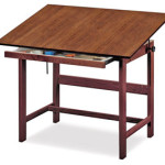
Ever wonder why we all seem to just love simple homepage designs or simple designs in general? I was pondering this the other day as I was looking at some of the furniture in my apartment. When my father was retiring a few years ago, he offered me a desk that he had in his office for many years. It was actually an architect’s drafting table and I loved it ever since I first laid eyes on it. The design of this table is true simplicity. It is very basic and plain. Essentially, it’s like a coffee table or a desk, but with very long legs. I was thinking, what really has drawn me to this table or other things in my life that are designed with no thrills, but with just simplicity and grace.
 Take for example my Apple laptop, which is a MacBook Pro I adore like so many million others around the globe. Its design shares many of the similar attributes and aesthetics as the architect’s table if you think about it. Their designs are simple, symmetrical and balanced. Many of my most favorite sites on the web share these similar characteristics as well. Why do we seem to like things that are designed with balance and order?
It seems like we are drawn to things that have these traits right? For example, in website design its no surprise that some of the top revered sites in their respective vertical (e.g. Google, MailChimp) present a very simple design and message. Now I have to profess that I am not a psychologist, sociologist or PHD in design, but it is intriguing how many of us around the globe from different nationalities and cultures gravitate toward these simple and balanced designs.
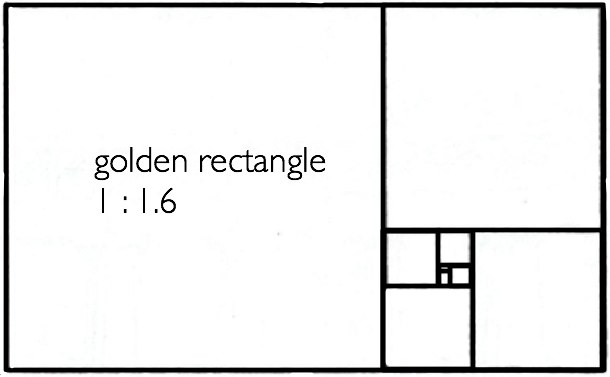
In fact, why we love simple designs and proportions that have symmetry might in fact just be a part of us it turns out. For more than 2,000 years, philosophers, mathematicians and artists have marveled at the unique properties of the “golden rectangle”: subtract a square from a golden rectangle, and what remains is another golden rectangle, and so on and so on — an infinite spiral. These so-called magical proportions (about 5 by 8) are common in the shapes of books, television sets and credit cards, and they provide the underlying structure for some of the most beloved designs in history: the facades of the Parthenon and Notre Dame, the face of the “Mona Lisa,” the Stradivarius violin and the original iPod.
Experiments going back to the 19th century repeatedly show that people invariably prefer images in these proportions, but no one has known why. Then, in 2009, a Duke University professor demonstrated that our eyes can scan an image fastest when its shape is a golden rectangle. For instance, it’s the ideal layout of a paragraph of text, the one most conducive to reading and retention. This simple shape speeds up our ability to perceive the world, and without realizing it, we employ it wherever we can. Website design is no stranger to this as well. Just think of all the golden rectangles that make a website truly stunning. I would argue that more simple a site’s layout and overall design is, the more we are able to capture these so called magical proportions that appeal to us so much.
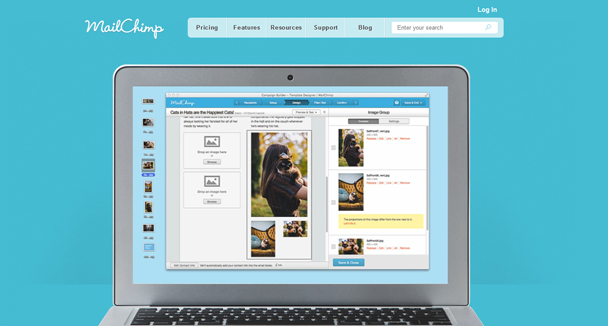
So the next time you are designing a homepage for a client or your company, try this exercise out. Try to keep the design, the message and the overall functionality as simple as possible. Take a step back and simply look at the page and see if you really need all that copy or links. Are you just trying to fit in too many messages and the end result is clutter? This is very common and rarely works. I encourage you to look at great sites like MailChimp, Google, AirBnB and of course Apple that are simple. Their raw simplicity makes their functionality seem so intuitive. This is a great goal to have and is well worth it. Remember, less is more.
Now, let’s take a look at a common homepage layout for many B2B companies. As one can see there are many golden rectangles in the overall layout of this design, but when you step back it’s clear that these shapes are not in harmony. They are really creating visual dissonance. With that being said, B2B websites are often achieving a somewhat different goal than B2C sites, but at the end of the day, all of these sites want their visitors to simply understand their concept and move them as effortlessly as possible to a sale.
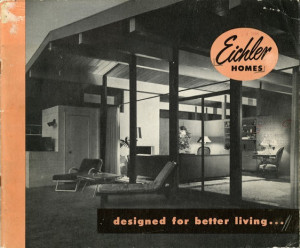
When Steve Jobs was growing up in California he was heavily influenced by the simple home designs that were ubiquitous in his region. Inspired by Frank Lloyd Wright’s vision of simple modern homes for the American “everyman,” developers such as Joseph Eichler and his imitators built houses that featured floor-to-ceiling glass walls, open floor plans, exposed post-and-beam construction, concrete slab floors and lots of sliding glass doors. Jobs said a while back when being interviewed while walking around his old hometown “Eichler did a great thing his houses were smart and cheap and good. They brought clean design and simple taste to lower-income people.” His appreciation for Eichler-style homes, Jobs said, instilled his passion for making sharply designed products for the mass market.
“I love it when you can bring really great design and simple capability to something that doesn’t cost much,” he said as he pointed out the clean elegance of the Eichlers. “It was the original vision for Apple. That’s what we tried to do with the first Mac. That’s what we did with the iPod.”
So perhaps my love for this architect’s drafting table is somewhat similar to Job’s affinity for the Eichler homes. Without a doubt, it is apparent that like so many around the globe we both love and appreciate simplicity in design. So let this be a simple reminder that you can do more with less. Try it out in your next design and see what happens.
